10_ __
| |
| |
__ | |
number | | | |
of 5_ | | | |
balls | | | |
| | | | __
| | | | | |
| | | | | |
___|__|__|__|__|__|___
G R Y
color of balls
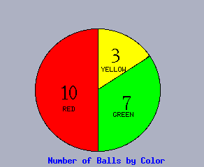
Frequency of Ball Colors
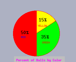
Note that we may divide the number (frequency) of each type by the total number (inthis case 7+10+3=20) to get the percent or relative frequency of each type. This information can also be displayed in a bar chart or pie chart:
              50%_        __
                         |  |
                         |  |
                    __   |  |
      number       |  |  |  |
        of    25%_ |  |  |  |
       balls       |  |  |  |
                   |  |  |  |   __
                   |  |  |  |  |  |
                   |  |  |  |  |  |
                ___|__|__|__|__|__|___
                    G     R     Y

                   color of balls

           Relative Frequency of Ball Colors
Note that the frequency or relative frequency of any sort of characteristic can be displayed with a bar or pie chart. Note also that some information which is not count information (such as miles per gallon of different cars) can be displayed as a bar chart, but cannot be displayed as a pie chart since the information is not parts of a whole.
                          __
                         |  |
               20_  __   |  |
      MPG          |  |  |  |   __
                   |  |  |  |  |  |
                   |  |  |  |  |  |
                ___|__|__|__|__|__|___
                    GM    BMW  Ford

                   Make of car
Caveat: Although much data (i.e., frequency or relative frequency of any sort of characteristic) can be presented with either a bar chart or a pie chart, there is some information that can only be presented with a bar chart. Pie charts divide a whole, and emphasize what portion of the whole each category comprises. Raw (count) data provides a whole (all the items counted), but one often has processed data such as per capita income where adding all the numbers together does not provide a whole, or disparate data such as the IQ's of Senators, where adding the numbers together does not provide a total intelligence; the latter types of data can be presented with a bar chart, but not a pie chart. Pie charts are appropriate when one wants to emphasize what portion of the whole each category is (compare the pie and bar charts above for this purpose), but bar charts are best for identifying which categories are largest (have you ever tried to choose the largest piece of a pie? it is easier to choose the biggest (longest) brownie.
The miles per gallon information for different car manufacturers (not real data) displayed as a bar chart below could not be displayed as a pie chart since the information is not parts of a whole.
                          __
                         |  |
               20_  __   |  |
      MPG          |  |  |  |   __
                   |  |  |  |  |  |
                   |  |  |  |  |  |
                ___|__|__|__|__|__|___
                    GM    BMW  Ford

                   Make of car
Competency: Represent the data set {CJJMCJMMJCMMM} of the religion (Christian, Muslim, Jewish) of 13 people interviewed in Jeruselem with both a bar chart and a pie chart; label them with both absolute and relative frequencies.
Reflection: What are all the decisions which you must make in order to represent a data set with a bar chart or pie chart?
What are the advantages and disadvantages of a bar chart versus pie chart?
Challenge: If you had the per capita income of the New England states, how could you modify that information to represent it in a pie chart?
July 2007